Cyber Fellows is a peer-learning incubator for emerging arts practitioners initiated by YTB Gallery in partnership with Gudskul in Jakarta and Flux in New York, with support from the Canada Council for the Arts.
YTB was looking for a brand identity and website for the pilot cohort of the online incubator to capture the spirit of their collective energy and showcase the research projects from the fellows.
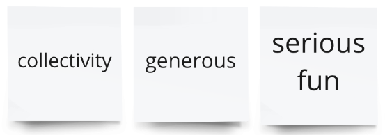
Three Words
To find out what the core ideas that needed to be expressed we began with a group session to listen to the members about what was at the heart of the incubator. Beginning with a brand questionnaire we came up with three key words that the brand should express: “collectivity”, “generous”, and “serious fun”.
Iterate, Iterate, Iterate
The driving force behind the incubator was to create an environment of collaboration over competition where the syllabus and goals were collectively generated and peering becomes the main support system. The first round of the incubator was completed and the YTB wanted the energy of the cohort to be represented in the imagery and feel of the brand.
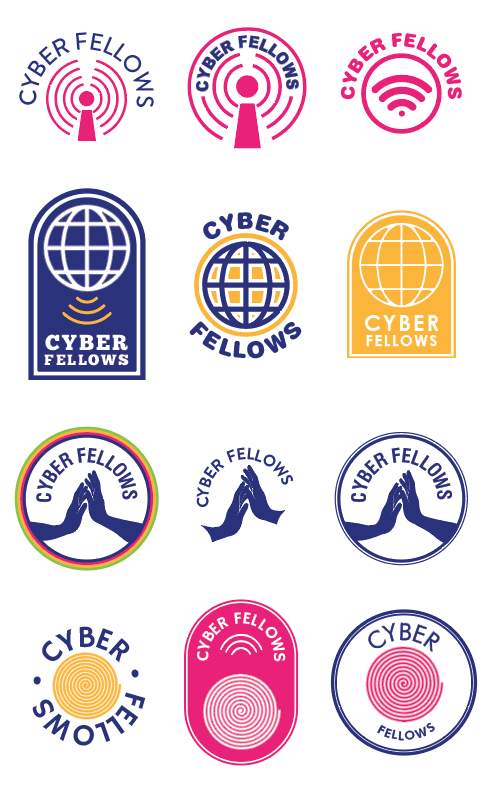
The website and visual language needed to be accessible for all to use and representative of the goals of the program. YTB had a clear idea of the brand colours, and so we used these options from the beginning, narrowing down to blue, orange and pink. Using the information we gathered together in the group brand workshop the following sketch ideas were created.
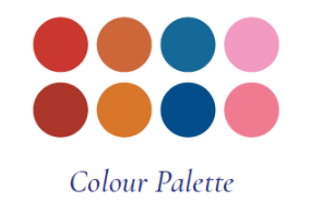
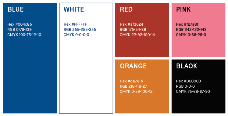
However, these colours were slightly too saturated and we were able to narrow down a more subdued palette of a navy blue, a rust coloured orange, a bubblegum pink, with small amount of an accent brick red.
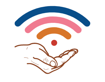
The second round of logos utilized this new palette and iterated on the wifi and hand iconography, with a more painterly feeling following the feedback from the team.
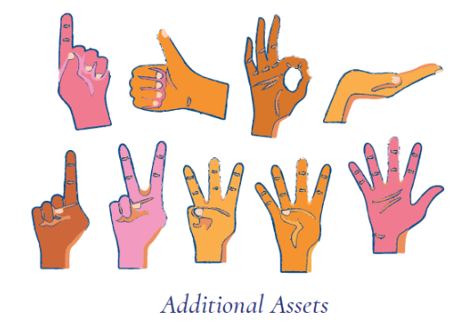
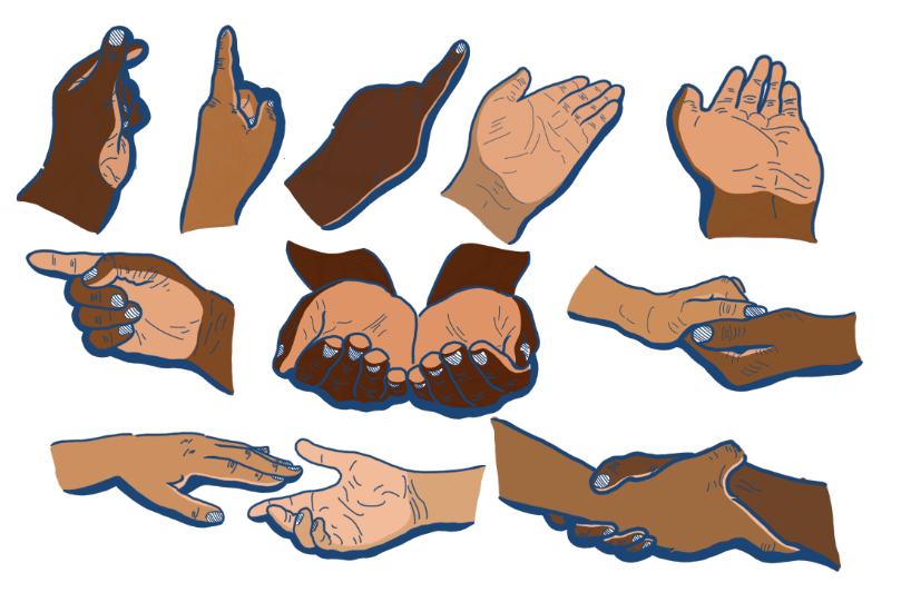
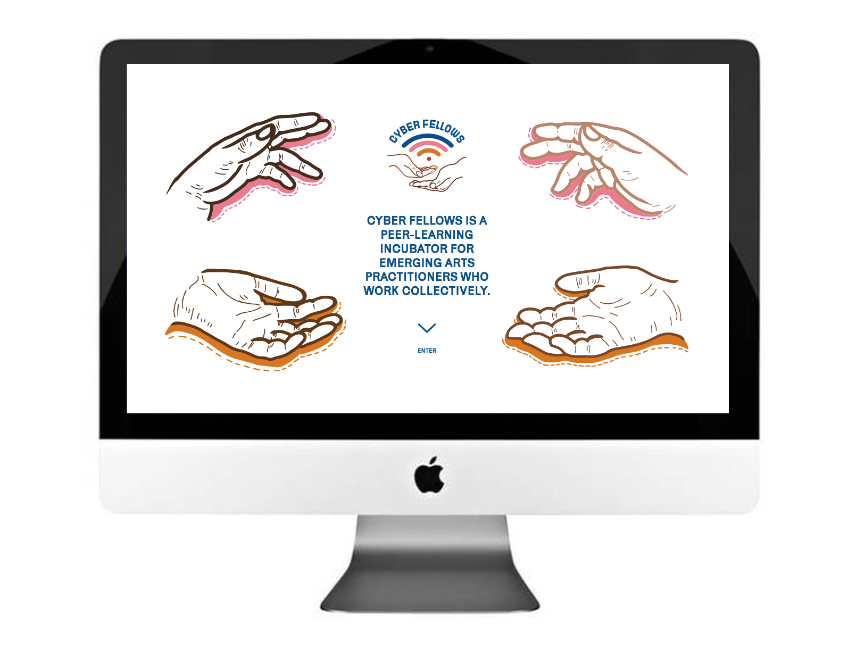
The incubator was run almost entirely online, and at the end of every meeting the fellows would sign off using hand signs to each other, so we decided to create some assets for the website that included hands in the visual language as a way to represent the diversity of the fellows and their ideas as a nod to the ways we find connection through the screen.
Final Identity
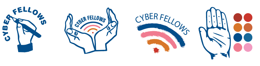
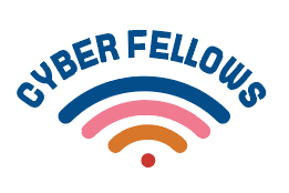
The final logo included the updated colour palette, wifi symbol, and hands. We decided on a logo set with slight variations that could be used in all kinds of sizes and use cases.
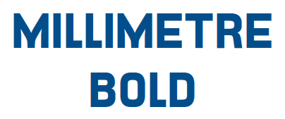
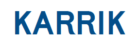
The typefaces needed to be clear and understandable for all users. We used Millimetre Bold, from font foundry Velvetyne, for the logo type. It’s grid based structure hinting at the online, “cyber” nature of the incubator. Our heading text Karrik, an off kilter sans-serif that is another Velvetyne creation, uses an exaggerated curve and uneven width on some characters that contributes a colloquial quality to the identity. For the body font we settled on Karla, a Google Font by Jonny Pinhorn that is widely available and has an open, quirky feeling that is easy to read in large blocks of text.
Our final colour palette utilizes blue and white as the primary brand colours, along with secondary colours of red, pink, orange and black. The below text/colour combinations are specifically approved for readability and accessibility.
At this point we brought in the inimitable illustrator Harmeet Rehal to update our hands for the assets and in the logo for final use. It was important to the team that the gestures and hands represented the diversity of the program and we made a collective decision to use natural colouring in the hands, rather than the unrealistic colouring of oranges and pinks as seen in the previous versions.
Website
The Cyber Fellows program was created to explore alternatives to costly, rigid graduate programs in the arts and provide a space to learn things that are vital to the conditions of working and making as an artist today, but are never addressed in school.
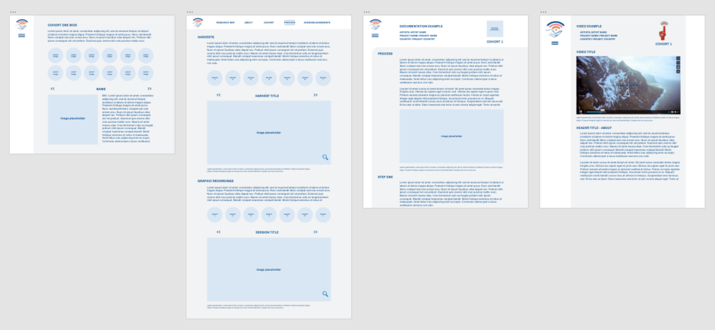
Our goals for the website were to showcase the Fellow’s research projects, and to be learning tool for emerging visual artists, curators, art writers, critics or students. We began with wireframes that would offer different layout possibilities for the various types of projects that were made, ranging from thought pieces to audio stories.
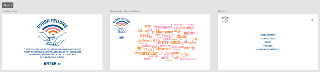
We wanted the user to know what Cyber Fellows was about as they arrived and decided on a landing page with the incubator tagline to leave a moment of recognition for the “what” of the project.
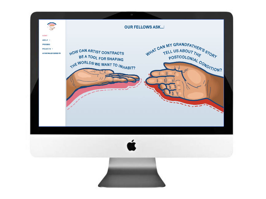
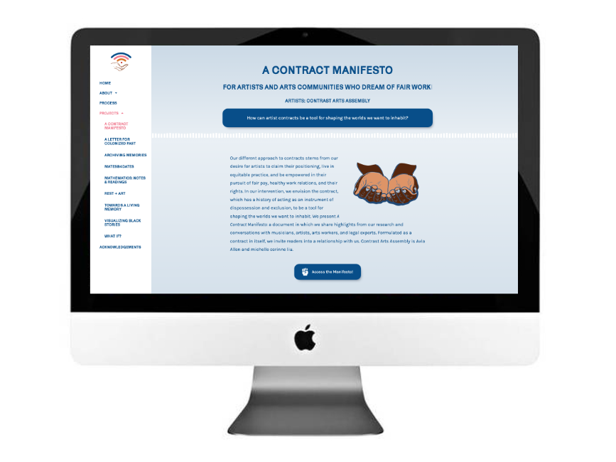
Each fellow’s project began with a research question and we used illustrations of hands with a text wrap of the question as an entry point into each of the projects. Leaving just enough ambiguity for the user to reflect on their personal answers and to get a sense of which work they might want to explore.
Each fellow’s page took a different shape depending on the media type, text and images of their work. We continued using the illustrated hands for each page and input details to showcase each project.