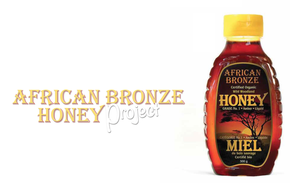
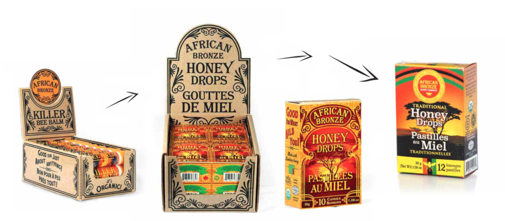
African Bronze Honey
Visual Identity, Product Design, Content Design
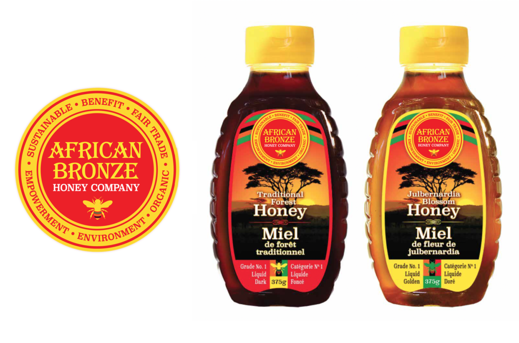
African Bronze Honey is a B Corporation, social enterprise that works with beekeeping projects throughout Africa to market their sustainably harvested, 100% natural, certified organic, forest honey. With a vision to create a global supply chain for the healthiest honey on the planet.
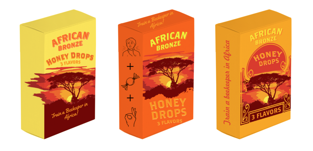
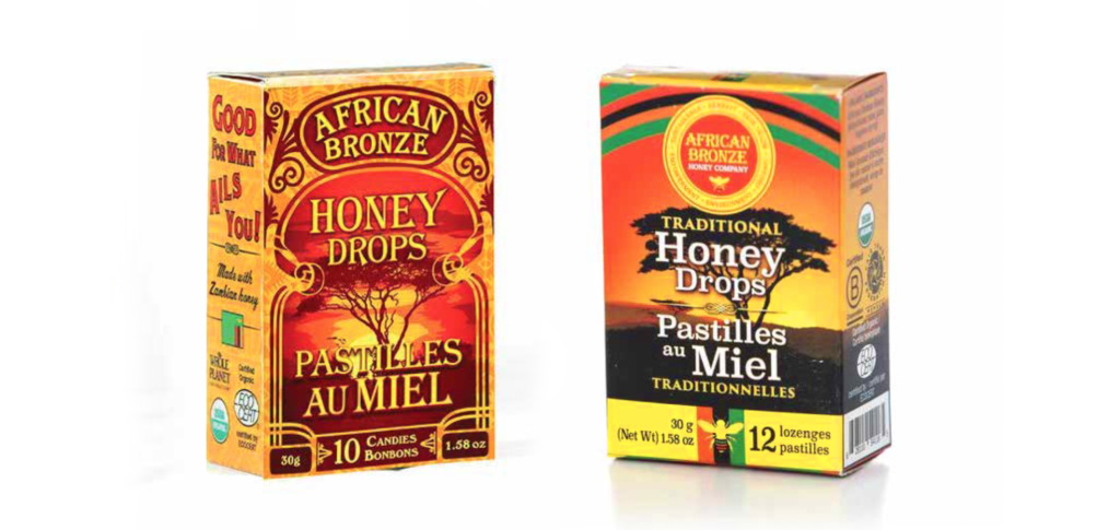
I joined this project at a time when the company was growing quickly. They needed an updated identity that could share their incredible story with more customers.